Hello #datafam
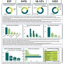
I'm excited to share with you my recent project as Data Analyst Intern at Alfido Tech, giving key Insight and recommendations on a Uber dataset by making use of analysis tool of Power Query and PowerBI for cleaning, calculations, analyzing and Visualization.
Uber is a technology platform that connects drivers and riders. As a driver, you use your vehicle to pick up riders and drive them to preferred destinations.Drivers earn money based on trips completed using the Uber app.
Key Insights
📌Category of Ride:
A larger percentage of the Uber ride fall under business category 91% while the rest 9% were under personnel.
📌Purpose of Ride:
Meeting top this group , Most of the people taking the ride are out for Meeting while charity and commute were less frequent
📌Monthly trend
August record the highest number of ride 133 while the least came from the month of December with just 27 rides.
Average monthly ride is 73
Average Daily ride is 4
📌Hourly trend
Peak of the ride was recorded at 5pm in the evening while least order for rides were at 2am in the morning.
📌Destination and location
Most trip started at Carl.
While Carl still have the highest destination number of rides
📌Miles covered
The average mile covered was 10.67miles and the least average miles by month was recorded in the month of December.
Recommendation
📍Proper data entry and documentation to tackle issue of missing values as seen in purposes column
📍Availability of more driver at the peak hours to help ease high orders
📍Promo and discounts on ride fees at the least preforming hours to encourage people to book rides at this hours
What do you think about this Visualization?
#alfidotech #uber #dataanalysis #dataanalytics #visualization #businessanalytics #dataanalyst #businessanalysis #Intern #openforjob
